AG-Grid is a fully dynamic javascript based data grid, which is compatible with different javascript frameworks such as Angular, React and Vue. In this article we will be using it with React.
Ag-Grid comes in two forms: ag-Grid Community (free for everyone, including production use) and ag-Grid Enterprise (you need a license to use).
Here we are going to talk about ag-Grid Community as it is free for everyone!
How to install:
npm install --save ag-grid-community ag-grid-react
Once it is installed we can use it as a component or a child component, just add these import lines when using it in a file.
import { AgGridReact } from "ag-grid-react";
import "ag-grid-community/dist/styles/ag-grid.css";
import "ag-grid-community/dist/styles/ag-theme-balham-dark.css";
So, firstly the question is why to use this grid, what purpose does it solve:
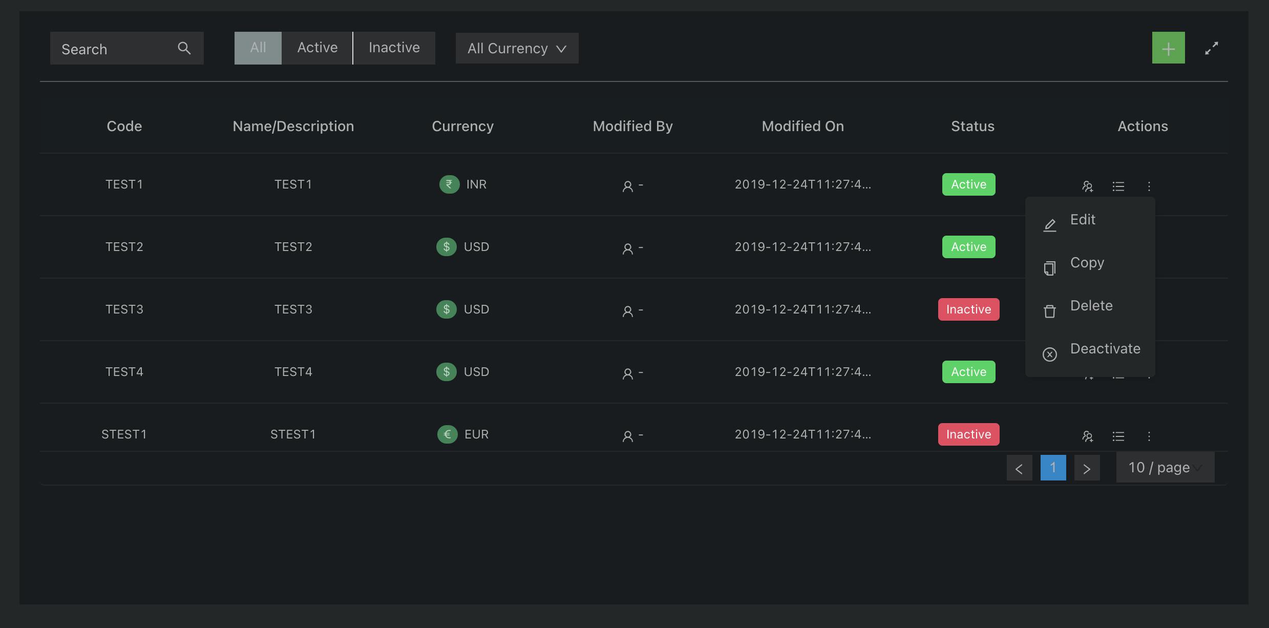
I will be stating the reasons due to which I went forward with this Grid. So the project I was working on demanded a fully dynamic grid, which takes its data and structure both from the backend, as well as has many functionalities other than the basic sorting and searching.
The project demanded a grid:
- Whose columns are rearrangeable
- Selectable rows
- Editable cells
- Export the grid as a csv (feature of allowing the users to download the created grid on their system as a csv file)
- Even the features were not fixed, that is, we wanted an agile component.
- Customizable Appearance
- Customizable Cell Contents
- Keyboard Navigation(customizable cell movement, such as using tab)
So I explored a lot of options (packages) present for creating grids, but none of them supported all these features with the ease which Ag-Grid handled it.
I will explain point by point how I achieved all the above functionalities using the Ag-Grid.
1. Dynamic row data and columns.
The requirement for the grid was as such that the rows and columns were not fixed, in that case I needed a grid that can take the data for its rows and columns dynamically.
We are using 2 components here, AgGridReact and AgGridColumn:
<AgGridReact rowData={rowData}>
  <AgGridColumn field="make"></AgGridColumn>
  <AgGridColumn field="model"></AgGridColumn>
  <AgGridColumn field="price"></AgGridColumn>
</AgGridReact>
Here rowData prop takes an array of objects, you can get the rowData from backend and use it in the grid, similarly for defining the columns of the grid, there is a prop named columnDefs.
<AgGridReact columnDefs={this.state.columnDefs}></AgGridReact>
Where columnDefs can be as follows:
columnDefs: [
             {
               headerName: 'Athlete',
               field: 'athlete'
             },
             {
               headerName: 'Sport',
               field: 'sport',
             },
             {
               headerName: 'Age',
               field: 'age',
               type: 'numberColumn'
            },
            {
               headerName: 'Year',
               field: 'year',
               type: 'numberColumn'
            },
            {
               headerName: 'Date',
               field: 'date',
               width: 220#
            }
           ]
Where headerName defines the Heading that has to be displayed on a column, and field acts as a unique key. There are many more properties that can be added to this columnDefs.
2. Rearrangeable Columns
The other complex requirement was to add the feature of dragging and rearranging the columns of the grid on different gestures.
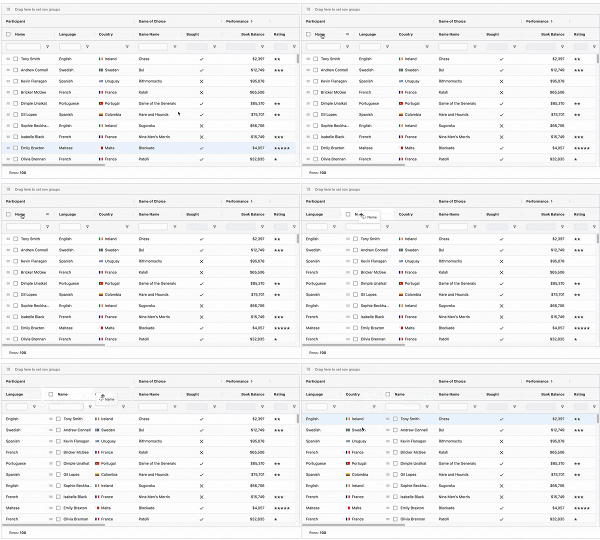
The columns in the ag grid are by default draggable and we can switch the places of columns simply by dragging and dropping it, but apart from this gesture based rearrangement, there is also the option of controlled rearrangement of columns using the gridColumnApi.
import React from "react";
import { AgGridReact } from "ag-grid-react";
import "ag-grid-community/dist/styles/ag-grid.css";
import "ag-grid-community/dist/styles/ag-theme-balham-dark.css";
import { AllCommunityModules } from "@ag-grid-community/all-  modules";
class Grid extends React.Component {
  constructor(props) {
    super(props);
    this.state = {
                  modules: AllCommunityModules,
                  rows: [{}, {}, {}],
                  columnDefs: [{
                                field: 'athlete',
                                suppressMovable: true,
                                width: 150,
                                cellClass: 'suppress-movable-col'
                               },
                               {
                                field: 'age',
                                lockPosition: true,
                                cellClass: 'locked-col',
                               },
                               {
                                field: 'country',
                                width: 150,
                               }]
                  gridApi: "",
                  gridColumnApi: "",
                 };
     }
onGridReady = (params: GridReadyEvent) => {
                this.setState({
                     gridApi: params.api,
                     gridColumnApi: params.columnApi
                   });
   };
onCountryFirst = () => {
           this.gridColumnApi.moveColumn('country', 0);
   };
render() {
    return (
         <div className="import-export">
            <div>
               <button
                   onClick={() => this.onCountryFirst()}>
                Country First
               </button>
            </div>
            <AgGridReact
                modules={this.state.modules}
                columnDefs={this.state.columnDefs}
                rowData={this.state.rows}
                onGridReady={this.onGridReady}
            >
            </AgGridReact>
         </div>
       );
     }
  }
export default Grid;
In the example above we have used gridColumnApi's moveColumn function to rearrange the column position, similarly there are many other functions.
GridApi and gridColumnApi are the main elements as all the methods belong to these two APIs and we can access any method using them.
Here is a list of methods that are offered by GridApi
And the list of methods that are offered by GridColumnApi
3. Selectable Rows
Row selection is a very common requirement for a grid in order to perform some operation on n number of rows at a time.
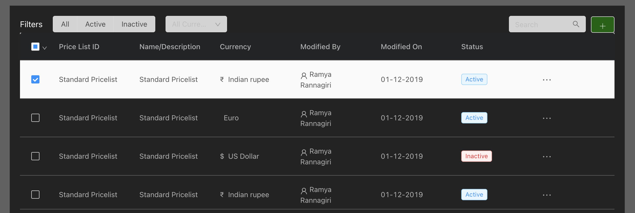
In order to make the rows of a grid selectable, we just need to add a prop in AgGrid, that is,
rowSelection={"multiple"} / {"single"}
And for accessing the selected rows, once selection have been done we use gridApi.
onSelectionChanged = () => {
      var selectedRows = this.state.gridApi.getSelectedRows();
 };
<AgGridReact
      modules={this.state.modules}
      columnDefs={this.state.columnDefs}
      rowData={this.state.rows}
      onGridReady={this.onGridReady}
      rowSelection={"multiple"}
      onSelectionChanged={()=>this.onSelectionChanged()}
 >
4. Editable Cells
The other complex requirement was to make some of the cells of the grid editable based on some product related conditions.
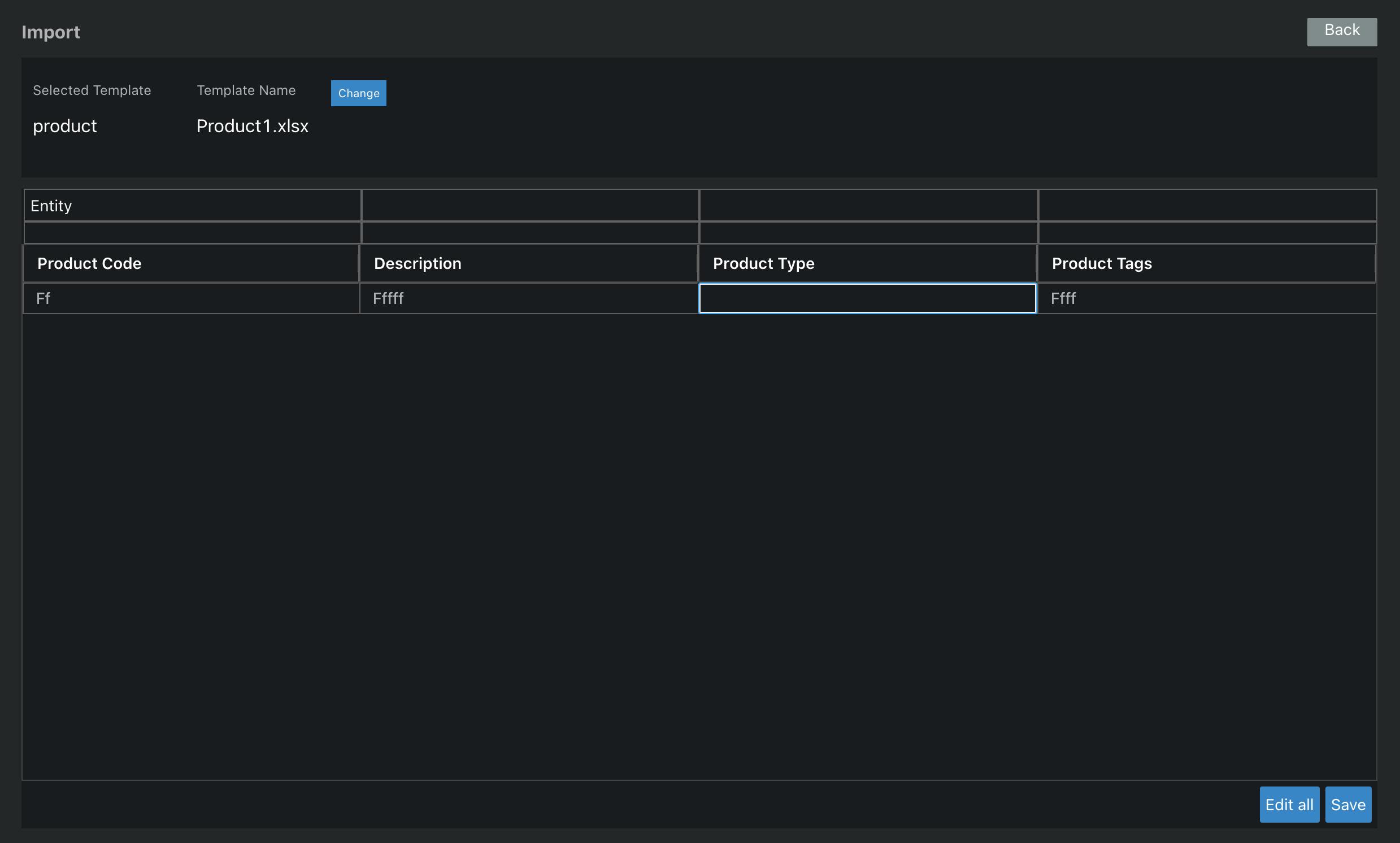
The simplest way to make all the cells editable in gird is by adding the editable prop as true in the defaultColDef.
defaultColDef: {
        editable: true,
       }
<AgGridReact
      modules={this.state.modules}
      columnDefs={this.state.columnDefs}
      rowData={this.state.rows}
      onGridReady={this.onGridReady}
      rowSelection={"multiple"}
      onSelectionChanged={()=>this.onSelectionChanged()}
      defaultColDef={this.state.defaultColDef}
 >
Other than that, there are many more advanced ways in which this grid handles the cell editing. For the detailed examples, the below link can help
ag-grid.com/documentation/react/cell-editin..
5. Export the grid as csv
The product demanded the feature that the users can download the grid as a csv file. For downloading the grid content as a csv, gridApi's exportDataAsCsv method is used.
onDownload = () => {
    const params = this.getParams();
    this.state.gridApi.exportDataAsCsv(params);
};
getParams = () => {
 return {
   customHeader: this.state.header,
   fileName: "your_filename"
  };
}
Here params can be customised according to how you want to export specific data as a csv. For more detailed explanation refer to this link.
ag-grid.com/documentation/react/export
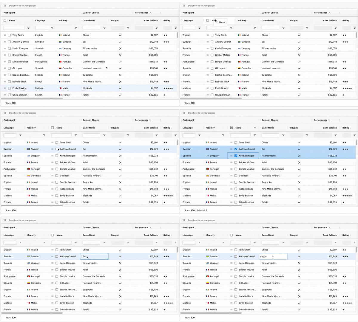
I have covered all the main features that made me use this grid, also tried to demonstrate small examples on how to achieve these features. I hope this proves to be helpful!